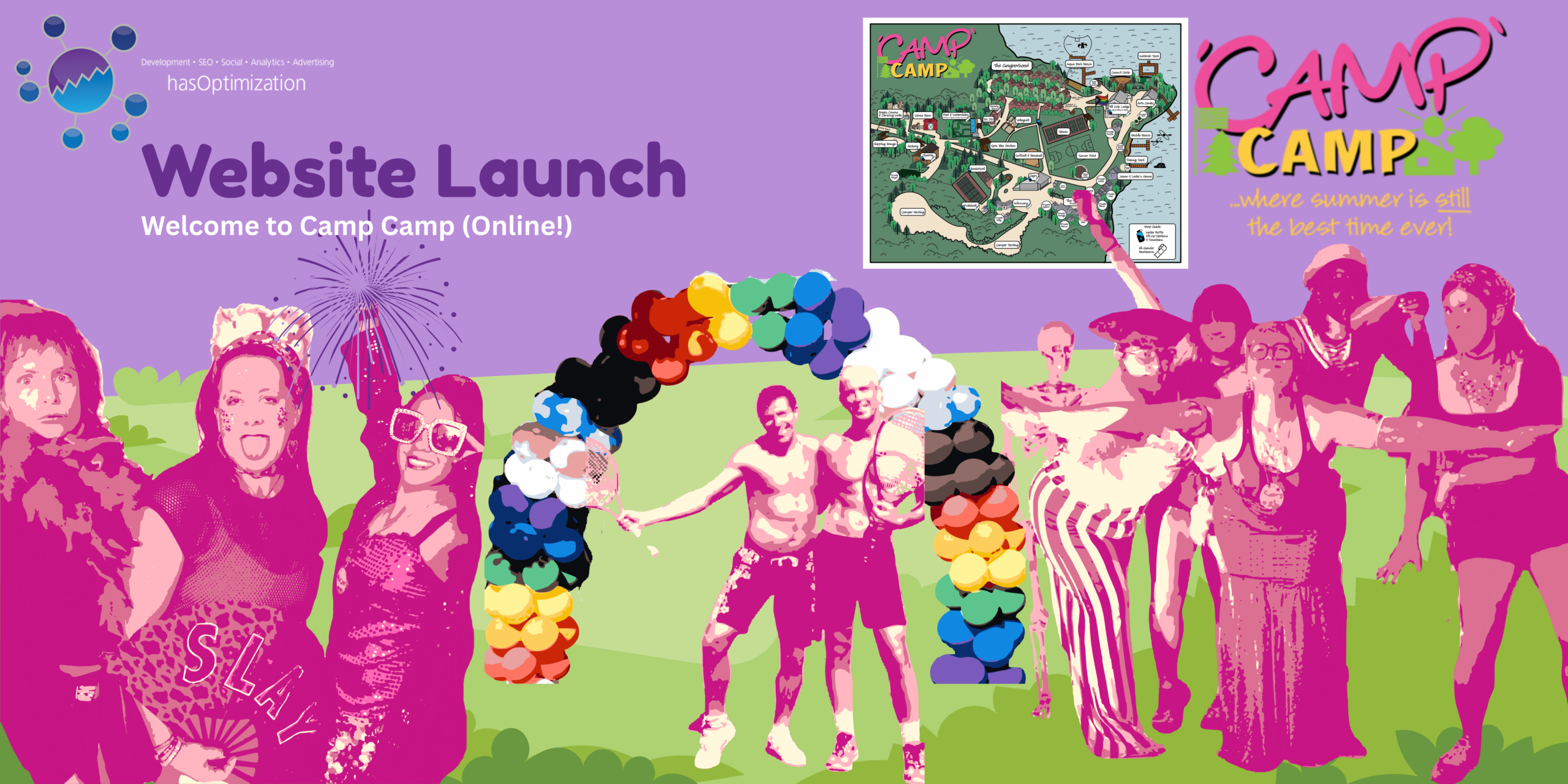
Posted by Aimee Cozza on October 10th, 2022
We’re excited to announce the launch of the new website for the Reproductive Freedom Fund of New Hampshire (ReproFund), which provides information and funding for abortion access.
ReproFund’s original site, on Weebly, needed a considerable facelift. Their original website was very bare-bones and simplistic, with some information harder to reach than was necessary. ReproFund wanted to prioritize responsiveness and security, which hasOptimization knows is important for every site. In addition, hasOptimization wanted to prioritize ease-of-access to information, accessibility, and user friendliness so people know exactly where to look for the information they need, and what lies behind each button click.

Design & Accessibility
ReproFund, when asked in our new site design questionnaire, cited our former project the Affirming Spaces Project as a website they’d potentially like to emulate. Bold colors and clean shapes and lines help this site look modern and crisp without looking clunky; we were excited to use Affirming Spaces Project and other similarly themed websites like Planned Parenthood and the ACLU to help guide the final design. They also mentioned that the quick exit feature present on former project OUT MetroWest was something they wanted as well, and we were happy to oblige!
Keeping in line with accessibility, we had to dial down a few of ReproFund’s chosen colors to meet web accessibility standards and keep content readable. High saturation colors and improper contrast ratio can cause anything from an inability to read the content provided, to sometimes even triggering an epileptic episode – certainly we did not want this for ReproFund’s site. Aiming to do no harm to website visitors is a stance we don’t take lightly; a more accessible web is one that’s better for everyone, after all.
Organization
We worked with ReproFund to reorganize information and display it in a visual manner that was not only appealing, but helped convey information that would normally be missed when applied in a simple text block fashion. We also helped ReproFund to use meaningful navigation items by nesting appropriate information under “resources” so people would know where to look without clicking all over the site.
All in all, we thought ReproFund’s site came out swimmingly well towards helping users find the information they need in a visually appealing way. We hope ReproFund will continue this trend in the future, and we wholly stand by their mission to provide affordable abortion access to everyone.
Need a new website for your new or existing business or organization? Learn more about hasOptimization’s website development services and contact us to schedule a consultation!