 Posted by Aimee Cozza on May 12th, 2022
Listen, I know you really love that handwriting font. You think it’s cute, and you think that it brings a level of personalization to your website and your branding… A bit of whimsy, perhaps. It’s less… Well, less structured than a traditional serif or sans-serif font. There has been research to suggest that utilizing handwritten fonts can increase sales. In some cases, I’d agree with you! I use what could be considered a “handwriting font” on my personal website, a font called “Permanent Marker”, which invokes a feeling of someone writing with permanent marker. But these loopy, curvy, handwriting fonts are all the rage, and are a designer and developer’s nightmare. Here’s why:
#1 Readability
You may think “this is cute!” but you also know exactly what that handwriting font is supposed to say. Some of the handwriting fonts out there get so loopy, so far and away divorced from a linear font that they’re nearly impossible to decipher what they say. If you want your brand to be instantly recognizable and understandable, you’ll steer away from a handwriting font that is illegible.
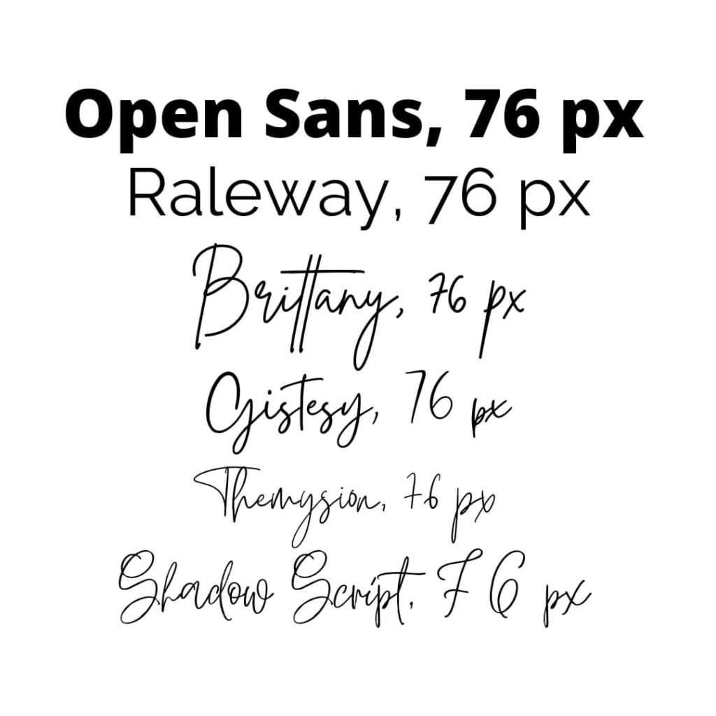
Try to figure out the names of these fonts below. Cs look like Gs and j looks like y and S looks like G. You can see why this would be difficult for someone to read.

#2 Practicality
One of my biggest complaints with handwriting fonts is they have to be displayed enormous to be legible. So, if you’re looking to have both a standard, sans-serif font and a handwriting font used interchangeably on your website, you need to insert styling rules that affect only the handwriting font because the handwriting font needs to be huge to be legible. That means writing an entirely different set of rules for all your h1s, h2s, h3s and so forth that have attached the handwriting class, and then testing and testing again to make sure that it’s reduced but still legible on mobile – and writing any media specific queries if necessary.
All of these fonts were written at 76 px, yet the consistency from font to font does not exist.

#3 Swap-ability
One thing Google likes to look at is how fast a page can load. If you’re loading an outside resource like, say, a font somewhere, your text still needs to be legible on the screen while that font is being fetched. This means utilizing the “swap” for font-display. That means you want to select a similar font likely already available on the visitor’s computer or phone until the asset is done downloading, then swap in the new font when it’s done. Ideally, you choose a font that is close to your destination font – usually for sans-serif fonts, you’ll select something like Geneva, Arial, or Helvetica. The problem is what looks like a handwriting font? Maybe you’ll opt for some standard cursive, or just go straight sans-serif with it, but either way your visitor is likely to see the swap happen if you don’t have your assets loading fast enough, and that can be annoying and jarring.
If you must use a handwriting font, try to follow these rules:
- Use sparingly, for single words or very short sentences
- Use only on headers and never on paragraph or description content
- Always ensure context clues are present
- Choose fonts that are more legible over fonts that are more “whimsical”
- If the font cannot be read at 18 px, it’s probably not the right font for most uses
- Squint at it – if you can’t tell what the letters are, or they look messy, choose a different font
I hope that helps you make a better decision when it comes to font choices and font pairing for your website and brand design! Remember, the more accessible your content is, the more customers you’re likely to reach.


