Posted by Aimee Cozza on December 30th, 2019
2020 is here, and while we predict that 2020 will show increased interest in web accessibility, we also are keeping our eyes on what seems to be trending recently for web design. While you don’t have to latch onto every trend you read, some trends are worth keeping, and others you can probably do without. Let’s take a look at trending web design for 2020.
#1: Web Accessibility
We think, in 2020, web accessibility will be highlighted and underlined. With good reason, too. A more accessible web is not only a moral obligation, but a legal one. Imagine all of the customers you’re missing out on with an inaccessible website. While we’ve written before on how to make your website more accessible, and your social media more accessible, we also now offer website accessibility testing and auditing to help you build a roadmap to improving your website for users with disabilities.
#2: Dark mode web design
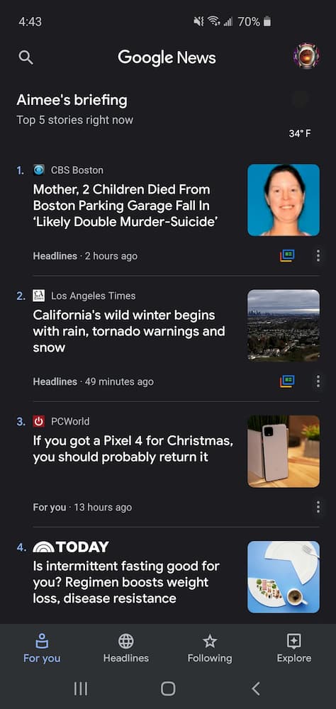
We’re all on the lookout for the next thing that can save us a little bit more battery life, and we’re willing to give up some things to squeeze out precious minutes from our device batteries. Dark mode was introduced in a variety of apps in 2019, including dark mode for Instagram, Android itself, Google News, Google Suite products and more. Dark mode design essentially sacrifices bright backgrounds that need to be illuminated for dark grey or even black backgrounds, meant to save battery life.
Dark mode web design also usually incorporates some minimalism as well, which we’ll talk about next.
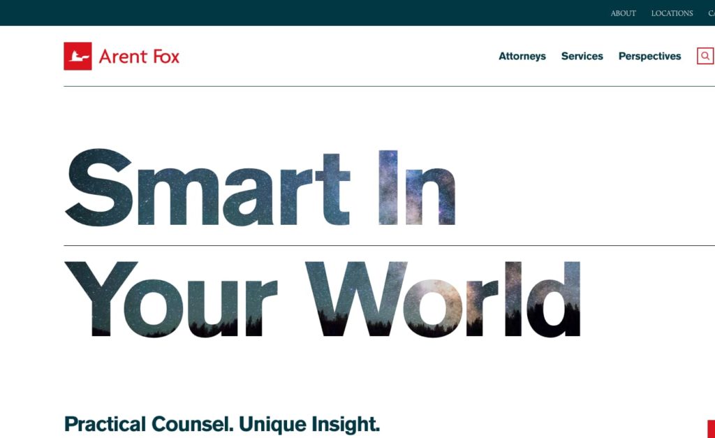
#3: Minimalism
Over the past few years we’ve gotten used to adding a ton of bloat to our websites. Whether that bloat is digital awards that customers don’t read nor care about, badges for digital memberships, ads, or something else, generally speaking, most websites can be pared down a bit to deliver a more streamlined and direct approach. When you start removing things that people don’t really care about, you start delivering a better user experience, a more targeted approach, and a faster website…
#4: Fast loading pages
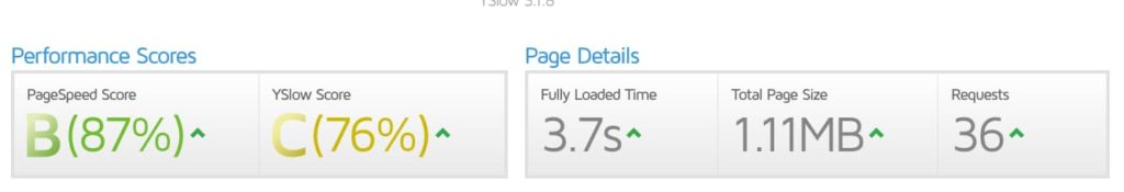
Google is likely going to look towards putting preferential ranking to websites that load faster. No customer wants to click on a website and wait forever for content to load, staring at a blank page, or getting bombarded with ads. It’s just not a good user experience. Google has some great tools to help you identify areas for improvement. While Google is not actively using page speed as a ranking factor, a fast moving site can help increase your customer experience, and prepare you for an eventuality that will likely come to fruition.
#5: Hand-drawn elements
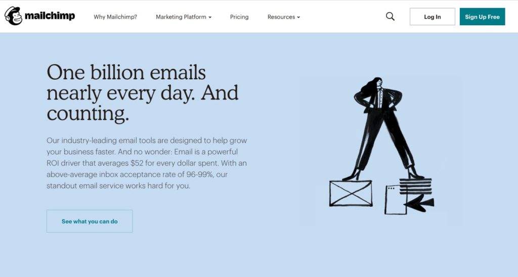
We’ve seen a lot of hand-drawn elements making a comeback at the end of 2019. MailChimp began using hand-drawn elements in their marketing, which helps to give an element of whimsy and personalization, rather than a cold, super professional appearance. It’s about giving your website some personality, but you have to know when and where to use these. Don’t use hand-drawn elements to replace easily recognizable elements that people need to use to navigate your website, and make sure your hand-drawn elements are polished.
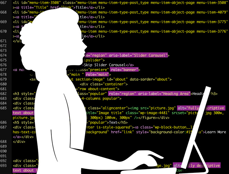
#6: Type only
Utilizing type, and only type, in design can be an important aspect that has a lot of great benefits. Not only will you have crisp design that will (hopefully) be readable at any size, any text you deliver will also be accessible to screen readers and web crawlers alike — plus reduce page load time. Styling text rather than using images to deliver your information, paired with typographical fonts that can deliver your message best, seems like it could quickly become a best practice in web design.
What are you hoping to see in trending web design for 2020? Are you going to use any of these elements? Let us know in the comments below!