Posted by Aimee Cozza on May 21st, 2019
A problem with the internet, and with the world in general, is that we put preferential treatment into building things that work for people who are able and able-bodied. When we say able, we mean people who can walk (and walk easily), people who are sighted or can see well, or any other variety of person who can do a thing that another person might not be mentally or physically able to do. That means that we often build websites, apps, and even homes and businesses with the able person in mind while completely forgetting about people who may not be able to say, use a set of stairs or fit a wheelchair through a narrow door or hallway.
On the internet, this accessibility problem mostly boils down to people who have limited vision or are blind. While we can design all we want for user experience to make the simplest and easiest experience for a user, if we do not take steps to make our websites and social media more accessible to those who cannot actually use visual elements, we are not only cutting out an entire market, we are also helping to contribute to countless years of preferential treatment to those who can, versus helping those who cannot.
Thankfully, there is some push (though not enough, in our eyes) on the internet now to make things as accessible as possible to those who have trouble seeing or who cannot see at all. These examples can come in the form of Tumblr darkening its branded identity background color to increase contrast ratios, websites such as banking websites that are taking on designs that are larger and bolder, and the ability to load alternative text into images on platforms like Facebook and Instagram.
The secondary benefit to embracing accessibility is that if a person who may be blind or have limited vision and may use the assistance of a screen reader to access the internet can better navigate your website, then Google and other search engines will as well… Screen reader technology is not too different from web crawler technology, so improving accessibility also means improving your overall search engine optimization.
Here’s what you can do to help:
1. Load Good Alternative Text On Images on your Website
In order for a screen reader to understand your images, you must supply them with the right information about your images. This is called alternative text, also known as alt text. Most website builders and content management systems allow you to easily load alt text into your images. If you are using simple HTML markup, the tag is alt=“alt text goes here” which will sit inside of the img tag.
2. Take advantage of Chrome’s built-in contrast ratio checker to see if your website is hard to read
Check this out! Chrome has recently added a quick contrast ratio checker so you can see if your website’s text might be too hard to make out. Simply open developer tools, click the element selector, and hover over the element you want to test.
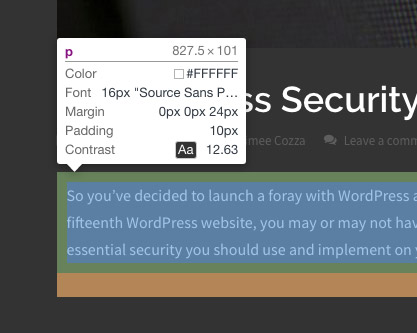
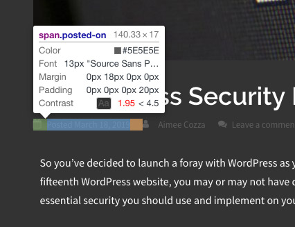
In this instance, the contrast ratio between the background and text on our blog is 12.63, which is excellent, versus the “meta info” we have beneath blog posts, which is failing at 1.95… Looks like we’ll need to make some changes! Web Content Accessibility Guidelines 2.0 (WCAG 2) level AA requires a contrast ratio of 4.5:1 for normal text and 3:1 for large text to be considered passable. If your ratio is in the red, chances are you should darken or lighten elements to make it more readable. Alternatively, you can also increase the size of your elements.
Unfortunately at this time you cannot check the contrast ratio of graphical elements, though you can use a tool such as WebAIM’s contrast checker by comparing hexadecimal values to one another.
3. Avoid developing content that can cause harm or undue burden
Gone are the days of flashing pop-up ads. While ads like that may have been easy to make and easy to capture someone’s attention, they could also knowingly trigger a seizure in an individual who may be prone to seizures. Here are some tips to help you avoid harming your audience:
- Do not design or implement features, images, or videos that can knowingly trigger a seizure. WCAG 2 guidelines state web pages that do not contain anything that flashes more than three times in any one second period, or the flash is below the general flash and red flash thresholds is considered level A. A web page that does not contain anything that flashes more than three times in any one second period is considered level AAA. You would do best to avoid any sort of “flashing” activities.
- Minimize movement on page. Pages with a lot of sliding, bouncing, blinking, and pulsing items can seem very high tech, but in reality, many people struggle to navigate websites with content constantly in movement. Having a funky parallax background is fine, but when you have letters, numbers, and headings floating all over the place, your website can turn more into a weird science experiment rather than a place to do business, and people may get frustrated with it and bounce quickly.
- Allow users enough time to read and absorb content. Allowing people to ability to pause or return to something is better than letting it go away forever. A good example of this is sliders. If you have a slider that does not have controls, it’s best to give people enough time to gather the information on those sliders before moving to the next by increasing the slide time. This means your slide content should stay put for at least 5 seconds.
- If you can, allow users to navigate and control your page with just a keyboard. This does not mean you should get rid of mouse over events or otherwise, but allowing someone to control via keyboard means screen readers can better access your content. Test your website without a mouse. Can you navigate it with your keyboard alone? If you struggle to surf your own website with just a keyboard, chances are it’s not accessible enough.
4. Structure your content appropriately
Any SEO specialist will tell you that using the right tags in your content is vital to having search engines understand your page content. Now, coupled with schema microdata, this can be even more important than ever. Still, this is even more important for individuals who may use screen readers for web assistance, as these proper tags really help give context and meaning to each element on a page.
Here’s a good example. We all know about heading tags: H1, H2, H3, etc. Without heading tags, how is a user who is unable to parse the visual formatting of a page going to perceive that you intended the page title to be a page title, and not just a normal part of the page? Without a “navigation” label, how will a person know where to click to get to the next portion of your site? Utilizing basic html structure such as form field labels, along with new ideas such as schema micro data, can help you not only improve your website accessibility for individuals with screen readers, but also help improve your visibility on search engines.
Have any other ideas for improving web accessibility? Let us know in the comments below!