Posted by Remy Housley on July 24th, 2023
We’re happy to announce the launch of a new website for Seattle Voice Lab! SVL is a trans-owned voice training business that helps trans and nonbinary individuals find their authentic voice.
Building a Fun and Effective Site

Seattle Voice Lab came to us with a new logo and new color palette that they wanted to use as the foundation of a new website that can bring in new leads and grow to provide resources for current students later on. The client had brought with them a paid WordPress theme in hopes of using it.
A Custom Build Instead of Elementor
After reviewing the theme the client brought with them, we made some strong recommendations for long-term life of the site. The client had initially selected a theme which relied on WYSIWYG page builder Elementor to deliver eye-catching pages. Because we strongly recommend against Elementor sites, we recommended instead going with a custom build that took into account the elements they liked best about the previous theme and utilizes the out-of-the-box functionality Gutenberg can now provide for any WordPress site. We wanted to invoke movement on the site, so we used custom CSS that create movement when you mouse over buttons, some headings, and some visual elements.
Before and After Clips Take Center Stage
With an audio-based business, we didn’t want their before-and-afters to get lost amid all the visuals on the new site, or to take up too much space on the homepage, where real estate is always tight, so our developer customized these eye-catching before and after modules for the homepage.

Balancing Aesthetic and Accessibility
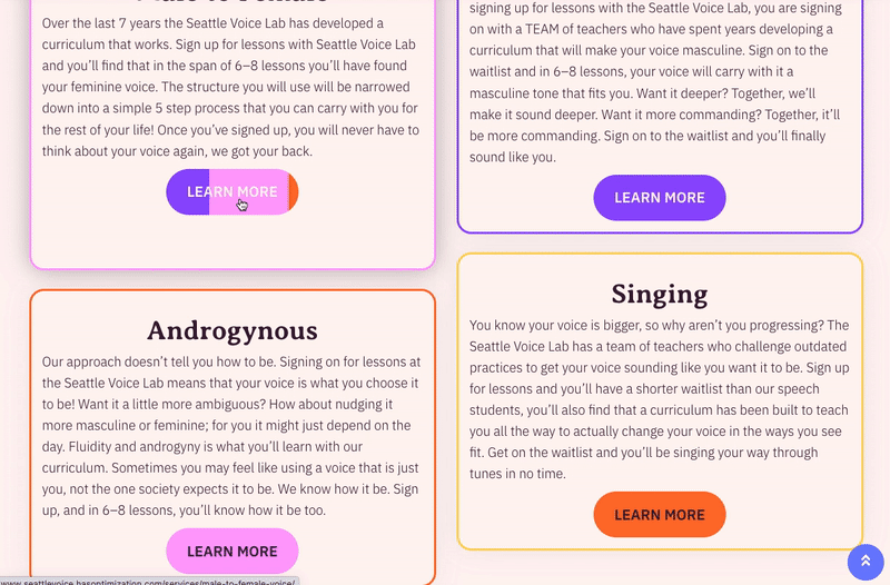
The color scheme that the client brought to us is fun and engaging, but created some limitations in terms of accessibility, because some of the color combinations don’t have enough contrast. By using wireframes instead of solid color backgrounds, limiting which colors were used as backgrounds for buttons, and adding a gradient between two brand colors for the hero, we were able to improve accessibility while maintaining the goal aesthetic.
The Result: A Rip-Roaring Fast Website That Performs Well And Looks Great
After launch, the site scored an A on a page speed audit provided by GT Metrix, which is what we love to see!
Whether you need a brand new site or want to refresh your old site, hasOptimization can help! Reach out to us to learn more!