Posted by Aimee Cozza on April 2nd, 2021
If you were around social media yesterday, no doubt you saw many jokes flying off during April Fool’s day. We joined in on the fun by releasing a retro, 1990s-early 2000s homepage full of loads of nostalgia for those old Geocities and Angelfire pages. There was a surprising amount of love and care put into this endeavor that actually made this page trickier than you would think.
Best viewed in Netscape 4.7!
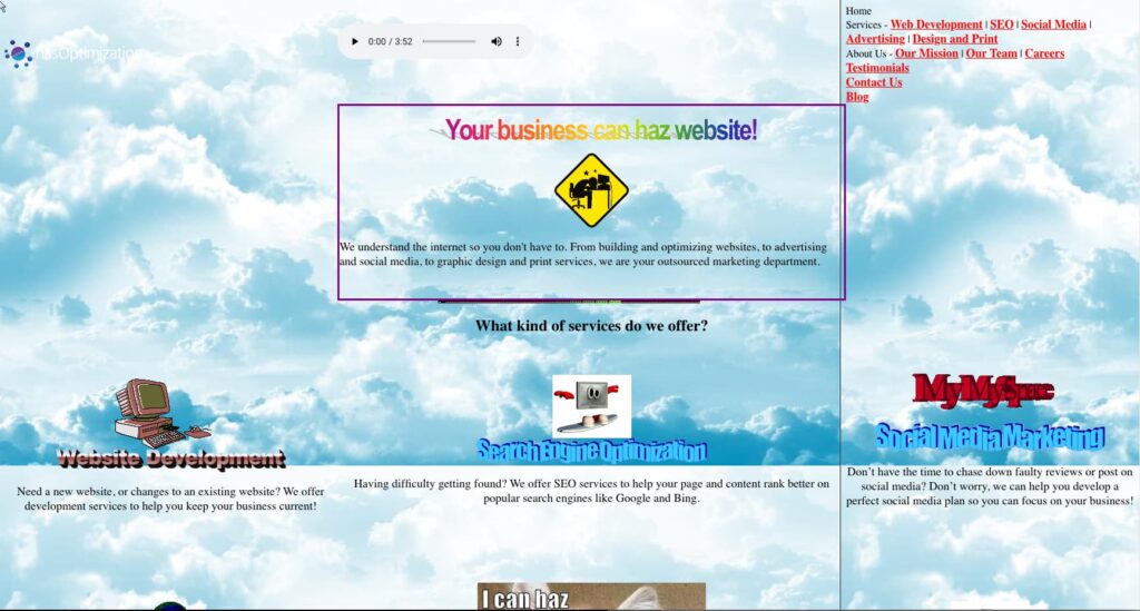
There were some principles of design that needed to be totally tossed aside, and others that needed to be embraced to make this happen. I had to ask: how much like 1990s web did I want this to be? Did I want to embrace responsive design, or make the page spill over on mobile? What was the line between “funny” and “totally obnoxious”?
Some of the key items I wanted to address were:
- Tiled and poorly seamed background
- Unset, serif font
- Limited use of default colors (HTML defined red, green, purple, yellow, etc)
- Limited use of CSS
- Overuse of animated gifs
- Word banners/word art in lieu of H2s and H3s
- Poor/bad/non-existent navigation
- Links everywhere to everything
- Auto-playing music for the ultimate experience
- Aligned to center everything
Technical difficulties
Many of the things allowed in 1990s web design are not allowed today. For example, auto-playing MIDI files as audio, which was a very specific and particular thing we all remember from 1990s and early 2000s web design, is no longer allowed in the modern browser. Converting that into something that is comparable would mean embedding a movie, YouTube video, or something else that would automatically begin playing. Still, I opted to take a very loud MIDI and convert it to mp3, embed that, and allow the visitor to control the music through the browser controller.
And yes, the song is “Moon Revenge” from Sailor Moon R.
Another thing that went largely ignored was png support in browsers was not something that usually happened. Either things needed to be made into gifs (if they had transparencies), or jpgs to be shown on the web page. With the word art I made, I converted them into gifs, but left the logo in the upper left hand corner alone. C’est la vie.
Added “features”
I picked certain items for inclusion due to their specific nostalgia reasons. One of those was the inclusion of the “made with Mac” badge, which Mac users, who were far and few between then with our beige towers and OS 8 and OS 9 (“Classic” to newer OS X users), used to show off their pride for their Apple machines like no other – complete with rainbow Apple logo. Not many built with a Mac back then as they were viewed as “useless” in many ways, so it was a “ha, look, I can also do this on a Mac just the same as you”.
Also added was a page view counter. The numbers are random and arbitrary, but it’s annoying and in the corner enough to give the page a little oomph.
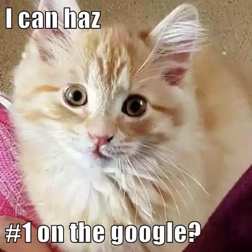
Logan, hasOptimization team leader, made the “I can haz #1 on the google?” cat meme — a call back to a cringey 2003 meme called “I can has cheezburger?” Not to be confused with fiestacat, of course.
Allyson, hasOptimization social media manager, created the open graph image (OG wasn’t even conceived of in 1990s-early 2000s internet, but we wanted to update our OG image to reflect the “new” homepage when sharing on Facebook and elsewhere). You can see it as our featured image for this blog post!
Mouse trails are something that might have shown up with some Javascript back in the day, though it was probably more often you’d see confetti or petals floating down on the website. Still, mouse trails were a thing in early Windows, so putting it as a bit of scripting on the page was a fun little touch.
We also added some modern web era items to ensure that we weren’t missing out on data or traffic, even for just a day. That means including meta title and description, relations to social and other header information search engines use, as well as our all too important analytics tag.
The things not added
There were some things that would’ve elevated the experience a little more that I opted not to do. The first was popup dialog boxes like, “Welcome to my site!!!” that forced user interaction when entering a site.
Another was a guest book, which I could’ve had up and running, but I scrapped it for time.
Frames were certainly a thing back then too, but I opted instead to go for the dreaded table (which allowed me to copy our current homepage’s content into grid-size boxes). It was not likely that a website would use tables in this manner back then, and instead lump all the content in one big long line of just… stuff, so the organization is still a little more advanced than early web pages.
Keyword stuffing, visibly, in the footer may have been something you would’ve seen, but I didn’t want Google to get upset with our joke homepage, so I left that out.
The end?
What a fun and harmless way to share a little nostalgia and April Fool’s day joy! If you missed out on the gag, we’ve archived the homepage at /april-fools for you to view. Let us know in the comments what you thought of our gag, and if there was something we could’ve done better!