 Posted by Aimee Cozza on October 31st, 2020
Often times, when building or updating websites for clients, we run into an issue with vernacular versus technical term when it comes to identifying where or how things should be changed or placed. We wanted to make a quick guide that can help developers as well as tech-minded people interact more clearly communication-wise when it comes to creating a website. Let’s get to the anatomy of a website!
First things first…
Not all websites are created equally, and not all websites will have the same areas, build methods, etc etc, so we’re just going to go over some common terms and placements rather than trying to be all inclusive.
Glossary
- Above the fold/Below the fold
- Button
- CMS
- Content
- Copyright
- CTA (Call to action)
- Dropdown
- Flyout
- Footer
- Framework
- Header
- Heading
- Hero
- Hover (Or “On Hover”)
- Images
- Menu
- Navigation
- Responsive
- Slider
- Spinbox
- Theme
Above the fold/Below the fold
These terms talk about the “fold” of a website. Think about holding a newspaper that is folded in half. Clearly there is content above the fold and below the fold. The content you would see first is above the fold, and when you unfold the newspaper, the next content you would read is below the fold. We translate this into websites to identify content that visitors view the very first thing they land on the page. Above the fold content is special in that it is your elevator pitch and will often determine if a customer continues to read the rest of your site.
Button
A stylized link, often with hover effects, that will take someone to another page. Copy in this area is often short such as “learn more” or “read more”.
CMS (Content Management System)
A CMS is a content management system that can provide the structure or framework for your website. CMS is used so updating page copy and content is not a big to-do and can be easily implemented. An example of a CMS is WordPress or Joomla, but arguably SquareSpace or Wix could also be considered a CMS.
Content
Content is something that is placed on a page and can be readily and easily swapped out without remaking the entire page. If using a CMS, often content can be changed by the client themselves if they wish.
The difference between content and structure
It’s important to note when speaking with your developer that they may ask for notes regarding a design or the structure of a design, and may ask you to disregard information related to content. That means that the developer or designer is asking you to comment on the physical attributes of the mockup or website, while ignoring what is actually placed on the site. Content is generally regarded as easily replaceable, so content usually comes in the form of images or text. Your designer or developer may ask you to overlook their choice of images or pre-written text to approve the look and feel of the site rather than the actual contents of that site.
For example, the “mockup” above does not actually contain good or live content, and we would ask that the client comment only on the actual look and feel — the structure — of the mockup rather than the images, content, and words. Is the menu in the right place? Is the logo in the right place? Does the client enjoy the slider or hero image at the top? Is the placement of the services OK? If yes, this means that the structure is good, but the content may need work.
Copyright
This often sits at the very bottom of the page inside the footer and may indicate the last time the site has been updated. A privacy policy link is often found here as well. Sometimes site developers may also leave a link to their own website down here. A typical copyright looks like: © [Year] [Site Name]
CTA (Call to Action)
A call to action is a section, line of text, image, or some other content that urges people to take a specific action. Sometimes that action can be subscribing to a newsletter, or clicking a button. A CTA is important to web flow, especially for landing pages, when designing with specific actions in mind.
Dropdown
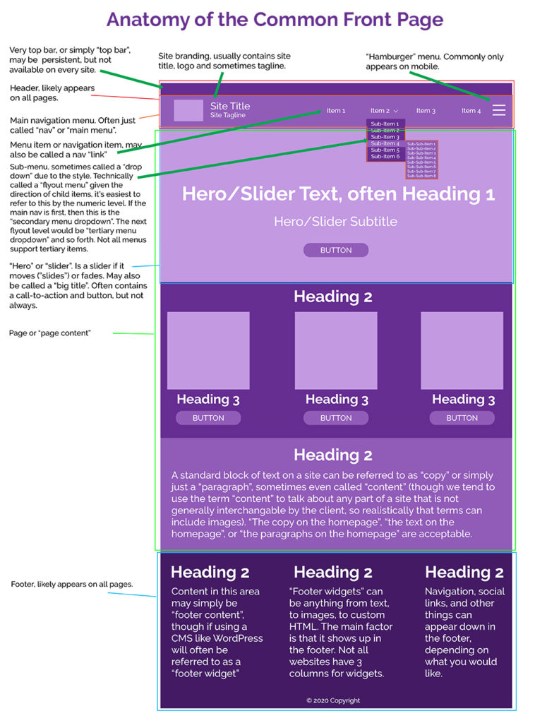
Often used erroneously used interchangably to talk about sub-menu items, a dropdown is a style of menu that allows a user to click or hover over an item, with the sub-menu dropping down below that item. Most flyout menus have dropdown menus as the first level of sub-menu, with a flyout (comes out to the side) menu happening on additional level menus.
Dropdown can also be used to talk about the style of menu when it comes to choosing items, say, in a multi-item selection contact form. A dropdown is different from a spinbox.
Flyout
A flyout menu allows for items or sub-menus to fly out of the side of the menu.
Footer
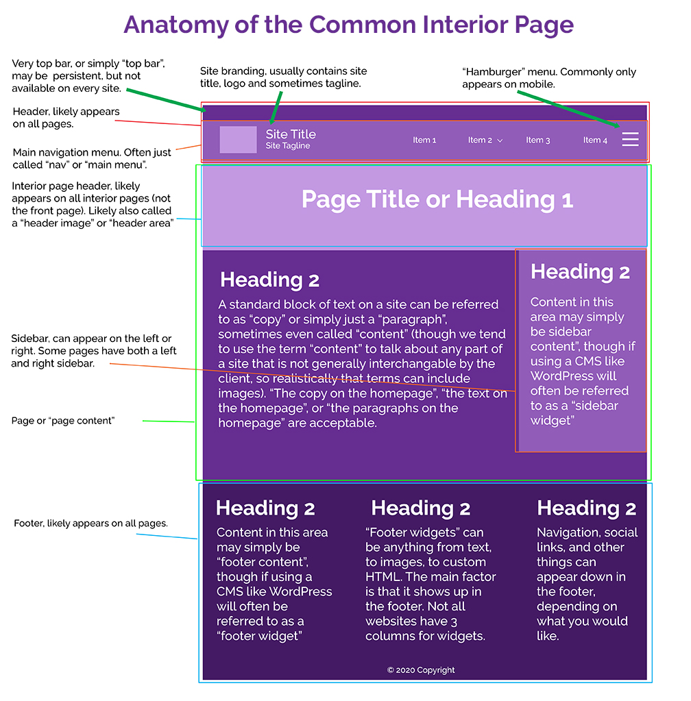
Most frequently visible on all of the website pages in a site, a footer often contains information you want to appear on all pages of the site, but may not make sense to place within the context of the page content. This often includes contact information, location details, and social media links. Footers can also contain special badges, contact forms, or other items that are helpful to be consistently available. A footer is always seated at the bottom of a page.
Framework
Front-end framework is different from a CMS as the CMS may provide the easy ability to manage your content, but may not deliver you a good base structure to begin building. Framework, such as Bootstrap, is a pre-made set of rules, styles, and guides that you can import to begin building a theme and subsequently pages within that theme. Another framework example is Genesis.
Header
A header is typically any content that appears at the top of the page on every page. Navigation, site branding, and more are often part of a header. There can be more than one type of header, including a header for the front page and a header for interior pages.
Header, however, can also refer to a specific set of HTML code that does not visibly print on the front end. “Place this code in the header of your site” may mean to place it between <head> and </head> tags.
Heading
Not to be confused with the above header, a heading is text set at a certain level that can act as a title for the content below it. It is important that the levels are set consistently and are nested properly for accessibility reasons. Headings are often styled to go from largest (H1) to smallest (H6), but are still bigger or bolder than standard paragraph text. If we were to look at headings in a list form, they would look like this:
- Heading 1
- Heading 2
- Heading 2
- Heading 3
- Heading 3
- Heading 3
- Heading 4
- Heading 3
- Heading 2
There should always only be one heading 1 (<h1>) per page.
Hero
This is the title of the large image area that may be on the front page, containing big text and sometimes a CTA button. The hero usually only exists on the front page, but may also be used on landing pages or other pages. It is sometimes also called the “big title” area, or sometimes just the “front page header image”. A hero typically doesn’t move, so if it moves, it may be a slider instead.
Hover (Or “On Hover”)
Hover refers to the action taken by specifically a mouse or desktop-based navigational instrument like a stylus. It’s important to note that hover does not occur on mobile devices including tablets. Hover, or on hover, is when you hover your cursor over an element. An element with specific styles or reactions that happen when you mouse over them will be referred to as having something occur on hover. So, for example, a button that changes color when you put your cursor over it is a button that changes on hover.
Images
An image is a visual element that is not text, and is not a design element provided via CSS. An image is often in the format of .gif, .jpg, or .png, or sometimes .webp. An image can also be a .svg as well. Images are often a part of content and not a part of structure.
Menu
A menu is an area that can be used to navigate a site. It is often used interchangably with navigation. However, a menu can appear in other areas of the site and does not necessarily need to be the main menu of the site used to get around. A menu of services, for example, can be in the footer. A menu of product categories can be in the sidebar.
Navigation
Navigation is what is used to get around on your website. Sometimes also called the “main menu”, the navigation can be at the top, bottom, or sides of the page. This is sometimes shorted to simply nav.
Responsive
When something is “responsive”, it means that the item, page, or site in question is able to reflow itself in a manner that makes the content easily accessible and viewable on other size screens. Responsive web design is important to allow desktop users, mobile users, and tablet users equal opportunity to access information on your website.
Not sure if a page is responsive? Take the corner of the browser window and change the size to be smaller and larger. If the content on the page moves around to accommodate the newly sized window, it’s responsive.
Slider
A slider (also called a “carousel”) is a moving element on a website capable of delivering multiple types of content within the same area. A slider, like a slideshow, often displays multiple images that will slide or fade (transition in some way) to the next image over a period of time. There is some question over whether or not sliders are actually effective tools for delivering content. Many people simply skip looking at sliders to browse page content instead.
Spinbox
A spinbox, not to be confused with a dropdown, is a way of delivering multiple options for selection. Think of a spinbox like the wheel on Wheel of Fortune. There are many items on the wheel, but only one can be selected. Spinboxes are often used as state selectors, day selectors, and time selectors.
This is a spinbox:
Theme
A theme is a set of framework and styling rules within a CMS that provides a base for a website to be built. A theme often develops the core information (such as size of headings) which allows you to drop in your own content to display in a palatable and visually appealing way.
We hope this list helps you understand some basic web design items and will help you communicate with your web development team a little more efficiently. Did we miss a term you’d like explained? Let us know in the comments!
