 Posted by Aimee Cozza on April 19th, 2018
By now, if you’ve spent any amount of time on the internet researching SEO and reading up on best practices, you may know that Google has begun to roll out what is known as mobile-first indexing. In this blog post, we’ll discuss mobile-first indexing, what it is, whether you should be concerned about your Google ranking being in jeopardy, and what you should look at to optimize your site.

What is mobile-first indexing?
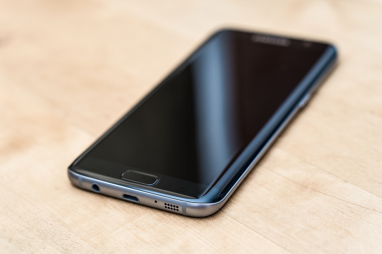
The first thing to know about mobile-first indexing is that Google is making these changes because of the colossal shift in the way people consume content on the internet. Historically, people have most often consumed webpages through desktop or laptop machines. However, since the advent of the smart phone and subsequent tablet, there has been a major shift in content being viewed through mobile devices (yes, tablets are considered mobile, regardless of size). As web designers and developers, we’ve known this, and that’s why we often push for responsive design that looks great on any size device. In fact, research suggests mobile traffic accounts for 57% of all traffic, which is a huge difference in how, traditionally, websites have been served.
So, what is mobile-first indexing exactly? The short version is that Google will begin crawling and indexing mobile versions of pages before desktop versions. Mobile versions of sites will be considered the primary version of your site. Tl;dr: Make sure your site looks good on smartphones and tablets, because that will be the only version that matters to Google soon.
What should I do?
If you have a mobile version of your website that is vastly different than your desktop version, you may want to brush up and refresh your mobile website to deliver the same information as your desktop version. Although there are tactics to take advantage of mobile users (and push to them the information they will find most useful in a mobile environment), we’re assuming if you’re reading this and concerned for your mobile site, you may not be taking advantage of responsive design, using a m. site, using a third-party app or site to handle mobile traffic, or otherwise may not have updated your website to 2018 design standards. Consider if it’s been quite a bit of time since working on your website starting fresh or investing in a new website. If you don’t know how to do it yourself, don’t worry, we can help.
What if I don’t have a mobile website?
Don’t worry — Google will just crawl your desktop site instead. Right now Google won’t be giving sites that don’t have a mobile site any sort of negative treatment, but that doesn’t mean that it couldn’t change in the future. Also keep in mind that if you don’t have responsive design, you may be turning away customers browsing on mobile devices. It might be a good time to think about a website upgrade!
What happens if I have a responsive website?
Since responsive websites — assuming it’s a good one — serve the same information to both desktop and mobile users (give or take certain elements you may turn off for mobile or otherwise) you should be OK. However, just because we’re saying should be OK does not mean just leave it. Now would be an excellent time to pick up your smartphone and tablet and do a page-by-page review of your website. Write down anything that seems problematic and make changes based on your findings. The easier you can consume the information and pages, the easier your customer can too.
When do I know if my site has been crawled via mobile-first indexing?
Google will let site owners know via Search Console, so make sure that you’re signed up and up-to-date with your attached email address. You can then monitor your crawl data so you can resolve any crawl issues reported by Google as quickly and efficiently as possible.
What should I do to prepare my mobile site?
There are a few things you can do to prepare.
- Test your mobile page. You can do this using your own personal device(s) or an emulator like Mobiletest.me.
- Check your speed rating. Use a site like GT Metrix or even Google’s own Page Speed Insights to see how you rank with mobile page speed.
- Check your SEO items. Meta titles, descriptions, and keywords. Make sure everything is up-to-par for latest snippet standards. Check for too long or too short titles and descriptions.
- Consider structured data. Structured data, also known as Schema data, can help the Googlebot crawl through your website and more accurately figure out what pages are about and displaying them in easy to consume ways. Consider using structured data in your website, especially if you have products or events you are running.
Have any comments about how you’re preparing for mobile-first indexing or questions? Let us know in the comments below!


